
About Me
Hi! I’m Nivethitha, a results-driven Business Analyst with a passion for solving complex problems through data and strategic thinking.With experience in gathering requirements, analyzing workflows, and delivering actionable insights, I bridge the gap between business needs and technical solutions.I thrive in collaborative environments and enjoy turning data into decisions that drive growth and efficiency.
Skills

Excel | Tableau | Power BI | Jira | Visio | SQL | Figma
Stakeholder Management - 1+ years
Project Management - 1+ years
Data Visualization - 1+ years
Business Analytics - 1+ years
Report Development - 1+ years
FDRs & BDRs Creation - 1+ years
Featured Projects
Power BI | Excel
Competitor Analysis for DaileFresh by using open data set and Power BI dashboard to pull and visualize competitor's performance.

SQL | Tableau
Bank Loan report using open data set and Tableau dashboard to view KPIs and Visual representation.
Stakeholder Requirement
This blog post explains the Calgary Green Line LRT's stakeholder matrix.

Professional Certification
My expanding portfolio of exam-based, distinctive certificates

Certified Scrum Master | Issued 2023
Power BI | Excel
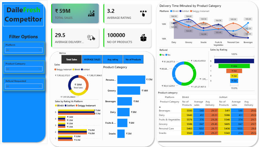
During my tenure at TimesMed Healthsoft Pvt Ltd, I was asked by my manager to do a Competitor Analysis. I used Data Visualization for easy and better understanding. Since I’m not allowed to post my original work. I made a replicate of the same with open data set sourced from Kaggle.com.
Business Requirements
To conduct a competitor Analysis of DaileFresh, they are: Swiggy Instamart, Blinkit and Jiomart’s sales performance, customer satisfaction, and inventory distribution to identity key insights and opportunities for optimization using various KPIs and visualizations in Power BI.
KPI’s Requirements
1. Total Sales : The overall revenue generated from all items sold.
2. Average Delivery time: The average Delivery time per sales.
3. Number of Items: The total count of different items sold.
4. Average Rating: The average customer rating for items sold.
Charts Requirements
1. Total Sales by Platform
Objective: Analyze the impact of Total Sales based on platforms
Additional KPI Metrics: Assess how other KPIs (Average Rating, Average Delivery Time, Number of Items) vary with platform.
Chart type: Donut chart.
2. Total Sales by Rating for Platform
Objective: Identify the performance of different platforms in terms of Sales and rating.
Additional KPI Metrics: : Assess how other KPIs (Average Rating, Average Delivery Time, Number of Items) vary with platform.
Chart Type: Stacked chart.
3. Total Sales by Product category
Objective: Compare total sales across different Product categories.
Additional KPI Metrics: : Assess how other KPIs (Average Rating, Average Delivery Time, Number of Items) vary with platform.
Chart Type: Bar chart.
4. Delivery Time by Platform by category
Objective: Evaluate how the delivery of product or product category influences the Platforms.
Chart Type: Line chart.
5. Refund by Total Sales for Platform
Objective: Analyze the Refunded Value based on total sales for each Platform
Chart Type: Donut chart.
6. Total Sales by Ratings
Objective: Assess Rating distribution of sales for different platforms
Chart Type: Funnel Map
7. All Metrics by Platforms
Objective: Provide a comprehensive view of all key metrics (Average Rating, Average Delivery Time, Number of Items) broken down by different platform
Chart Type: Matrix card.
Key Takeaways
1. Overall Performance:
o Total sales are ₹59M.
o The average rating across platforms is 3.2.
o There are 100,000 products with an average delivery time of 29.5 minutes.
2. Sales Insights:
o The largest sales are in the Personal Care category (₹17M), followed by Grocery (₹14M).
o Swiggy Instamart leads in total sales (₹19.5M), slightly ahead of JioMart(₹19.3M).
3. Ratings:
o Ratings are quite similar across platforms, with Blinkit and JioMart both around 3.7M in sales with higher ratings, while Swiggy Instamart, despite higher sales, has slightly lower ratings.
4. Delivery Times:
o Delivery times vary by product category, with Dairy and Grocery generally having faster delivery compared to Fruits & Vegetables and Beverages, especially for Blinkit and JioMart.
5. Refunds:
o Most transactions do not involve refunds (₹1,06,45,453.5 vs ₹1,07,27,107.0 with refunds), suggesting relatively stable service.
6. Detailed Comparison:
o In the heatmap, Beverages and Dairy categories are consistent across platforms in terms of the number of products and delivery times (~29.5 min), but sales and ratings differ slightly.
Key Insight
Swiggy Instamart is leading in total sales despite not having the highest rating, indicating either wider reach or more aggressive pricing/marketing. Personal Care and Grocery are the most lucrative categories, and delivery times are competitive but could be optimized further in certain categories (like Beverages).The dashboard is completely dynamic and adjusts depending on the Filter options.To Watch the demo of the Power BI dashboard, click the link down below.
SQL | Tableau
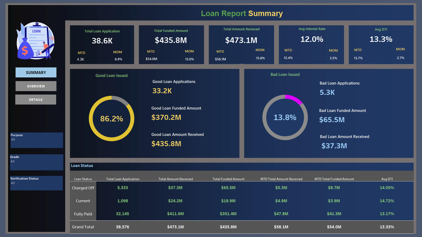
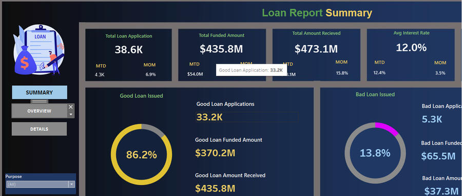
DASHBOARD 1: SUMMARY
"In order to monitor and assess bank's lending activities and performance, we need to create a comprehensive Bank Loan Report. This report aims to provide insights into key loan-related metrics and their changes over time. The report will help us make data-driven decisions, track our loan portfolio's health, and identify trends that can inform our lending strategies.
Key Performance Indicators (KPIs) Requirements:
Total Loan Applications: We need to calculate the total number of loan applications received during a specified period. Additionally, it is essential to monitor the Month-to-Date (MTD) Loan Applications and track changes Month-over-Month (MoM).
Total Funded Amount: Understanding the total amount of funds disbursed as loans is crucial. We also want to keep an eye on the MTD Total Funded Amount and analyse the Month-over-Month (MoM) changes in this metric.
Total Amount Received: Tracking the total amount received from borrowers is essential for assessing the bank's cash flow and loan repayment. We should analyse the Month-to-Date (MTD) Total Amount Received and observe the Month-over-Month (MoM) changes.
**Average Interest Rate: **Calculating the average interest rate across all loans, MTD, and monitoring the Month-over-Month (MoM) variations in interest rates will provide insights into our lending portfolio's overall cost.
Average Debt-to-Income Ratio (DTI): Evaluating the average DTI for our borrowers helps us gauge their financial health. We need to compute the average DTI for all loans, MTD, and track Month-over-Month (MoM) fluctuations.Good Loan v Bad Loan KPI’s
In order to evaluate the performance of our lending activities and assess the quality of our loan portfolio, we need to create a comprehensive report that distinguishes between 'Good Loans' and 'Bad Loans' based on specific loan status criteria
Good Loan KPIs:
Good Loan Application Percentage: We need to calculate the percentage of loan applications classified as 'Good Loans.' This category includes loans with a loan status of 'Fully Paid' and 'Current.'
Good Loan Applications: Identifying the total number of loan applications falling under the 'Good Loan' category, which consists of loans with a loan status of 'Fully Paid' and 'Current.'
Good Loan Funded Amount: Determining the total amount of funds disbursed as 'Good Loans.' This includes the principal amounts of loans with a loan status of 'Fully Paid' and 'Current.'
Good Loan Total Received Amount: Tracking the total amount received from borrowers for 'Good Loans,' which encompasses all payments made on loans with a loan status of 'Fully Paid' and 'Current.'
Bad Loan KPIs:
Bad Loan Application Percentage: Calculating the percentage of loan applications categorized as 'Bad Loans.' This category specifically includes loans with a loan status of 'Charged Off.'
Bad Loan Applications: Identifying the total number of loan applications categorized as 'Bad Loans,' which consists of loans with a loan status of 'Charged Off.'
Bad Loan Funded Amount: Determining the total amount of funds disbursed as 'Bad Loans.' This comprises the principal amounts of loans with a loan status of 'Charged Off.'
Bad Loan Total Received Amount: Tracking the total amount received from borrowers for 'Bad Loans,' which includes all payments made on loans with a loan status of 'Charged Off.'
Loan Status Grid View
In order to gain a comprehensive overview of our lending operations and monitor the performance of loans, we aim to create a grid view report categorized by 'Loan Status.' This report will serve as a valuable tool for analysing and understanding the key indicators associated with different loan statuses. By providing insights into metrics such as 'Total Loan Applications,' 'Total Funded Amount,' 'Total Amount Received,' 'Month-to-Date (MTD) Funded Amount,' 'MTD Amount Received,' 'Average Interest Rate,' and 'Average Debt-to-Income Ratio (DTI),' this grid view will empower us to make data-driven decisions and assess the health of our loan portfolio.
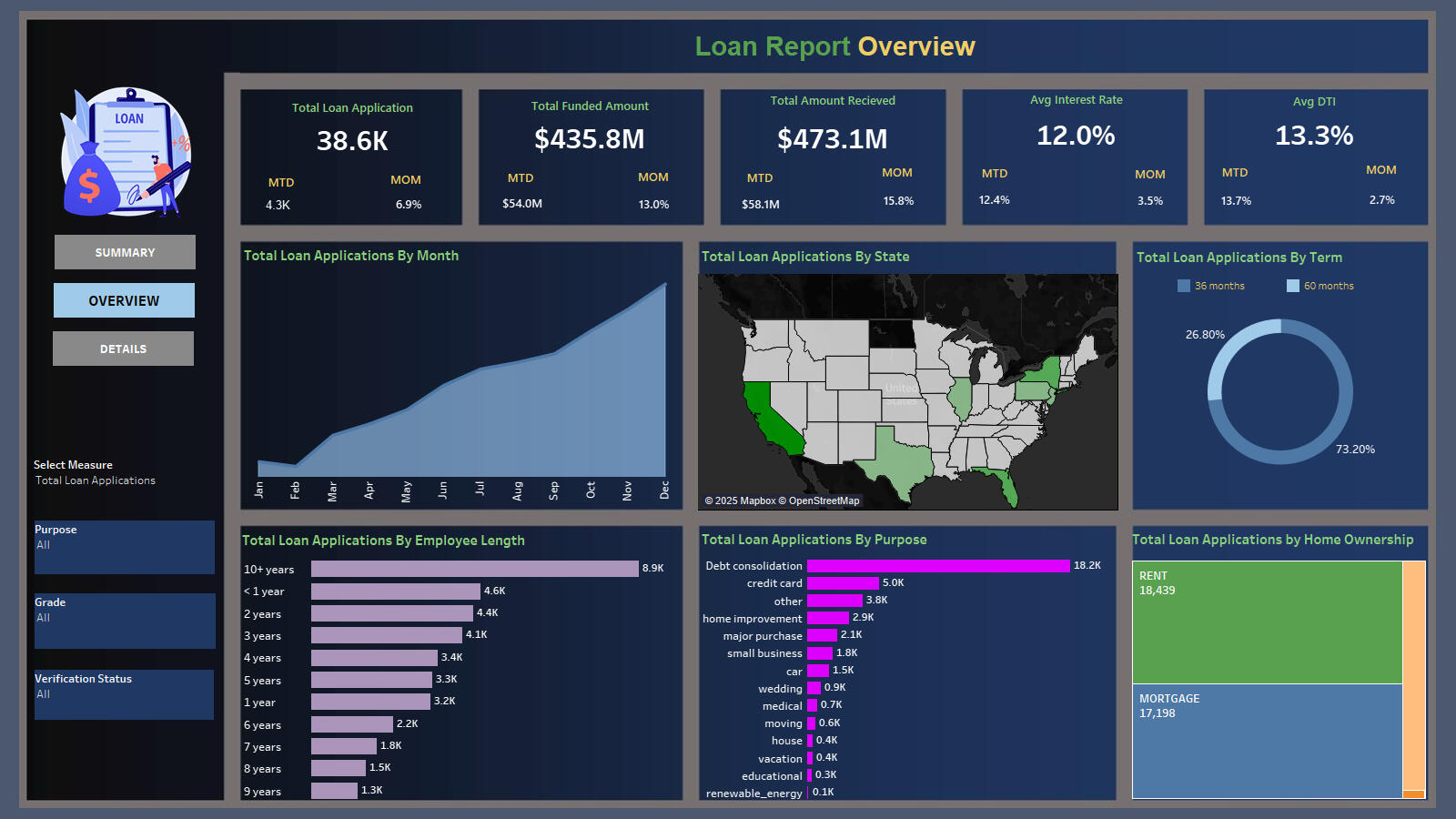
DASHBOARD 2: OVERVIEW
In our Bank Loan Report project, we aim to visually represent critical loan-related metrics and trends using a variety of chart types. These charts will provide a clear and insightful view of our lending operations, facilitating data-driven decision-making and enabling us to gain valuable insights into various loan parameters. Below are the specific chart requirements:
1. Monthly Trends by Issue Date (Line Chart):
Chart Type: Line Chart
Metrics: 'Total Loan Applications,' 'Total Funded Amount,' and 'Total Amount Received'
X-Axis: Month (based on 'Issue Date')
Y-Axis: Metrics' Values
Objective: This line chart will showcase how 'Total Loan Applications,' 'Total Funded Amount,' and 'Total Amount Received' vary over time, allowing us to identify seasonality and long-term trends in lending activities.
2. Regional Analysis by State (Filled Map):
Chart Type: Filled Map
Metrics: 'Total Loan Applications,' 'Total Funded Amount,' and 'Total Amount Received'
Geographic Regions: States
Objective: This filled map will visually represent lending metrics categorized by state, enabling us to identify regions with significant lending activity and assess regional disparities.
3. Loan Term Analysis (Donut Chart):
Chart Type: Donut Chart
Metrics: 'Total Loan Applications,' 'Total Funded Amount,' and 'Total Amount Received'
Segments: Loan Terms (e.g., 36 months, 60 months)
Objective: This donut chart will depict loan statistics based on different loan terms, allowing us to understand the distribution of loans across various term lengths.
4. Employee Length Analysis (Bar Chart):
Chart Type: Bar Chart
Metrics: 'Total Loan Applications,' 'Total Funded Amount,' and 'Total Amount Received'
X-Axis: Employee Length Categories (e.g., 1 year, 5 years, 10+ years)
Y-Axis: Metrics' Values
Objective: This bar chart will illustrate how lending metrics are distributed among borrowers with different employment lengths, helping us assess the impact of employment history on loan applications.
5. Loan Purpose Breakdown (Bar Chart):
Chart Type: Bar Chart
Metrics: 'Total Loan Applications,' 'Total Funded Amount,' and 'Total Amount Received'
X-Axis: Loan Purpose Categories (e.g., debt consolidation, credit card refinancing)
Y-Axis: Metrics' Values
Objective: This bar chart will provide a visual breakdown of loan metrics based on the stated purposes of loans, aiding in the understanding of the primary reasons borrowers seek financing.
6. Home Ownership Analysis (Tree Map):
Chart Type: Tree Map
Metrics: 'Total Loan Applications,' 'Total Funded Amount,' and 'Total Amount Received'
Hierarchy: Home Ownership Categories (e.g., own, rent, mortgage)
Objective: This tree map will display loan metrics categorized by different home ownership statuses, allowing for a hierarchical view of how home ownership impacts loan applications and disbursements.
These diverse chart types will enhance our ability to visualize and communicate loan-related insights effectively, supporting data-driven decisions and strategic planning within our lending operations."
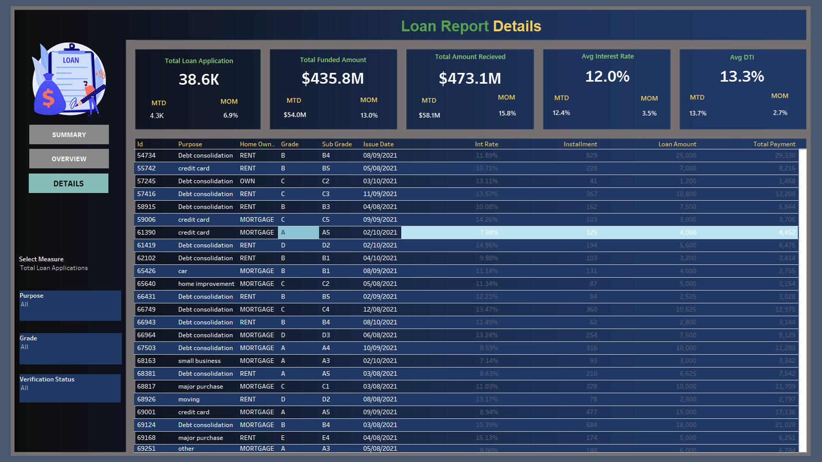
DASHBOARD 3: DETAILS
In our Bank Loan Report project, we recognize the need for a comprehensive 'Details Dashboard' that provides a consolidated view of all the essential information within our loan data. This Details Dashboard aims to offer a holistic snapshot of key loan-related metrics and data points, enabling users to access critical information efficiently.
Objective:
The primary objective of the Details Dashboard is to provide a comprehensive and user-friendly interface for accessing vital loan data. It will serve as a one-stop solution for users seeking detailed insights into our loan portfolio, borrower profiles, and loan performance.The dashboard is completely dynamic and adjusts depending on the Filter options.To Watch the demo of the Power BI dashboard, click the link down below.
Stakeholder Requirement
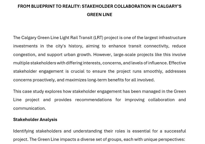
The Calgary Green Line Light Rail Transit (LRT) project is one of the largest infrastructure investments in the city's history, aiming to enhance transit connectivity, reduce congestion, and support urban growth. However, large-scale projects like this involve multiple stakeholders with differing interests, concerns, and levels of influence. Effective stakeholder engagement is crucial to ensure the project runs smoothly, addresses concerns proactively, and maximizes long-term benefits for all involved.
This case study explores how stakeholder engagement has been managed in the Green Line project and provides recommendations for improving collaboration and communication.
Stakeholder Analysis
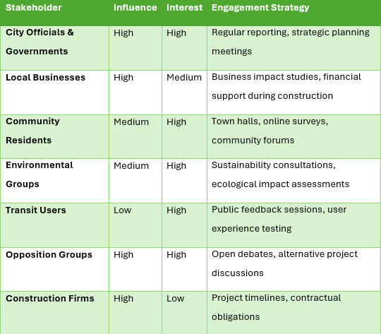
Identifying stakeholders and understanding their roles is essential for a successful project. The Green Line impacts a diverse set of groups, each with unique perspectives:
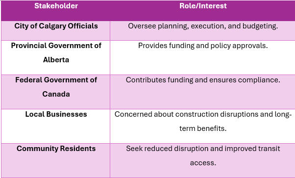
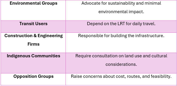
Stakeholder Needs and Characteristics
Each stakeholder group has specific concerns and expectations:
• City of Calgary Officials – Need to ensure the project is delivered on time and within budget while maintaining public support.
• Provincial & Federal Governments – Require transparency in spending and measurable benefits.
• Local Businesses – Want minimal disruptions and long-term economic advantages.
• Community Residents – Seek property value retention and efficient transit services.
• Environmental Groups – Demand sustainability and minimal ecological impact.
• Transit Users – Expect reliability, affordability, and accessibility.
• Opposition Groups – Concerned about project costs, alternative routes, and long-term feasibility.Stakeholder Matrix Analysis
A stakeholder matrix categorizes stakeholders based on their level of influence and interest:
Stakeholder Influence vs. Interest Graph
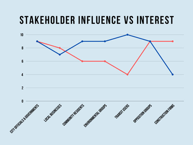
This analysis helps prioritize engagement efforts and allocate resources effectively.
Collaboration and Communication Methods
Different stakeholders require different engagement approaches. Here’s how communication has been structured:
1. Transparent Communication
• Regular public updates via social media, press releases, and official project websites.
• Monthly progress reports to government bodies.
2. Stakeholder-Specific Engagement
• Community Residents: Town hall meetings, online Q&A sessions, email newsletters.
• Local Businesses: Financial assistance programs, direct meetings to discuss mitigating construction impacts.
• Transit Users: Public trials of proposed transit routes, interactive digital feedback platforms.
• Environmental Groups: Consultations on reducing emissions, integrating green spaces, and eco-friendly construction.
3. Handling Opposition Proactively
• Addressing concerns raised by opposition groups like “Rethink the Green Line” through formal debates and data-driven justifications.
• Evaluating alternative route suggestions and cost concerns transparently.Findings and Recommendations
Key Insights:
1. Early Engagement Matters – Delays in addressing business concerns have led to skepticism about the project’s benefits.
2. Tailored Communication is Essential – Generic messages do not resonate with all stakeholders; specific engagement strategies yield better results.
3. Managing Expectations is Crucial – Setting realistic timelines and expectations helps prevent public frustration.
Recommendations:
• Improve Construction Planning: Introduce phased construction schedules to minimize disruptions for businesses and residents.
• Strengthen Transparency: Publish real-time construction updates via an interactive website and mobile app.
• Expand Community Participation: Establish a citizen advisory committee to give residents a stronger voice.
• Monitor Long-Term Impact: Develop post-construction evaluations to measure economic and environmental benefits.Conclusion
The Calgary Green Line LRT project demonstrates the importance of effective stakeholder engagement in large-scale urban developments. By understanding stakeholder needs, utilizing strategic communication, and proactively addressing concerns, projects like this can gain public trust and achieve long-term success.
With improved transparency, structured engagement strategies, and responsive communication, the Green Line project has the potential to transform Calgary’s public transit landscape while maintaining strong community support.